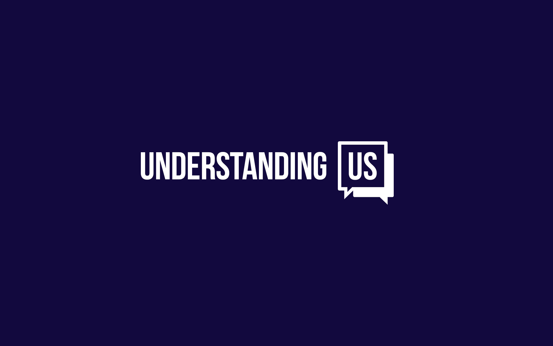
Understanding US
Brand Identity
An inclusive system of communicating that helps us all feel seen and heard.
Understanding US is a non-profit organization that was establishing during the height of the pandemic and during a time of passionate cultural divisiveness. Their goal is to break down communication barriers and help train others on how to effectively communicate to arrive at an understanding with one another – because before we are political parties, we are people.
The main challenge was help build a brand identity that stood for inclusiveness and empathy during a time division. People developed a lack of trust in institutions and unwavering personal perspectives on cultural and political topics. Understanding US needed to have a voice without taking a stance. Therefore, the design approach relied heavily on solutions that reduced subjective notions and can be experienced with impartiality in a non-political, socio economic, or cultural way.


A system of empathy
An open and inclusive design system was established to help guide all visual and verbal combination. This helped to ensure that through Understanding US, everyone would feel seen and heard.
We called this combination of rigor, humanity and design – a "system of empathy". It was based on the need for all visual and verbal communication from Understanding US to be viewed as bi-partizan and not taking a political or cultural stance on any specific subject.

An inclusive mark
The Understanding US logo-mark was designed to demonstrate the organizations inclusive and collaborative nature.
Through color and shape, the mark is used as a dynamic representation of a variety of opinions coming together through collective conversation to reach a deeper understanding of one another.

A non-offensive palette
The color palette needed to represent Understanding US from a non political point-of-view. Any color usage that was demonstrative of a political party or of socio economic affiliation would create tension and automatic dismissal from their intended audience.
Cool tones inspired by the American landscape and home decor where utilized to create a calming and approachable feel. The palette also had to be expansive enough to demonstrate the variety of ideas/ thoughts/ opinions that Understanding US stood for supporting.
Lastly, ADA compliance was of high importance. Brand guidelines helped to clarify which color combinations could be used in conjunction with one another based on communication needs.

Stock, but stylized
As a non-profit brand with humble financial beginnings, free stock photography and system fonts were a design requirement.
Keeping in mind that the primary audience was comprised of a political tinder-box of unwavering ideologies, skepticism and a variety of socio economic backgrounds – particular attention to detail was required around every visual and verbal que. This meant leaning into simple graphic illustrations that felt impartial while helping to support the messaging.

My role & contribution
I was lucky enough to work with a small but highly seasoned team. This meant that each of us were able to hike up our sleeves and take an active role in the creation of the work. My contribution consisted of the overall design direction, system and execution of the core elements within the Understanding US brand identity.
Direction
Harry Garcia - EDD
Chris Huban - EDD
Cory Galster - GDD
Tiffany Vurek -UX
Design
An Vuong - UI
Victoria Honey -UX
Account/ Prod
Samantha Cranston