Brand Identity
New Orleans
Brand identity and revitalization for the city of New Orleans.
New Orleans is a city of graphic juxtaposition. Black and white and rich and poor and church and brothel, stacked on top of each other over and over and over, again. It’s been called a gumbo, a mess, and sensory overload. We call it, Elegant Grit. It’s this great contrast that creates a place so fertile for storytelling.
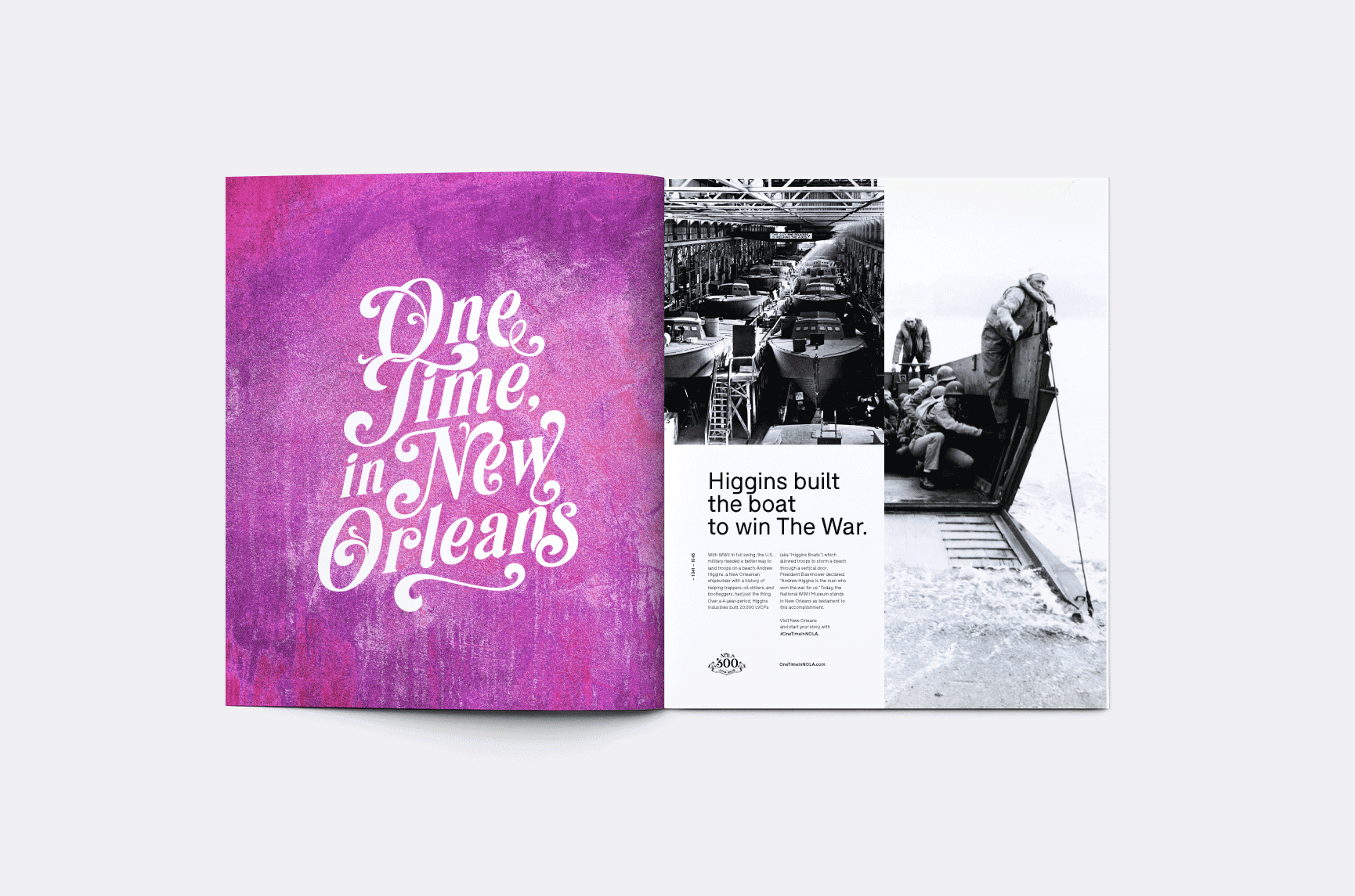
Historic moments and barroom exaggerations share the same (below sea) level footing. This new brand system for the city’s 300th birthday steals from all of them.
Every single element – from colors to textures to inside jokes – is lifted directly from the cities stories. So, pull up a chair. Pour yourself a drink. Grab a plate. Tell us a story. The great ones start the same way, "One Time, in New Orleans."

The handwritten logomark was created in collaboration with SixAbove Studios.
www.sixabovestudios.com

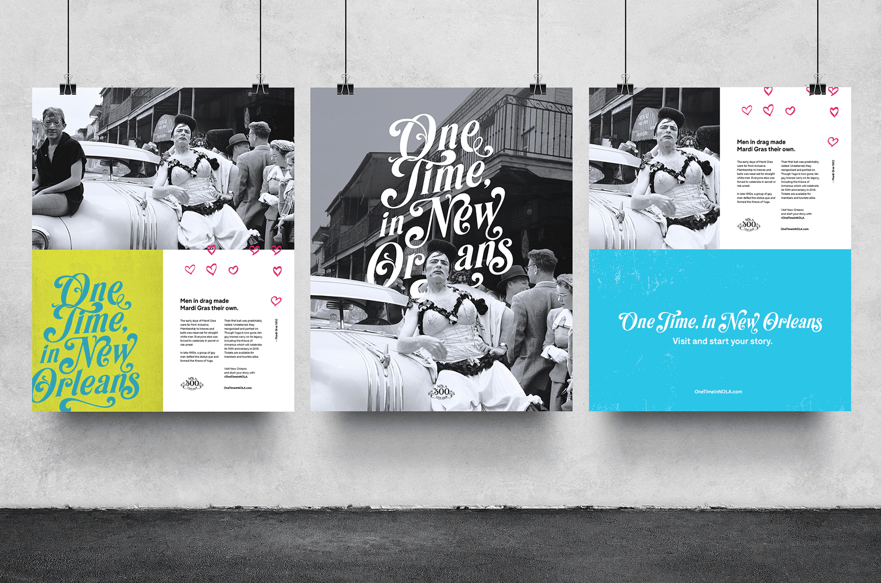
The Tricentennial campaign’s premise is simple – everyone leaves New Orleans with a story as their souvenir. The “One Time, In New Orleans” logomark is inspired by some of its best ones. It’s handwritten like the number you left for that cute boy at the bar. It’s made from the music clefs that brass band played on a street corner after midnight. It’s embellished with fleurs-de-lis from Garden District debutante parties and Magazine Street mom and pops.


The color palette was pulled from shotgun houses, bungalows and cottages. Its foundational principles are inspired by the City of New Orleans Vieux Carré Commission Guidelines for home owners and exterior painting. Each color scheme is named for a real New Orleans location which tourists can visit on every trip.

In New Orleans, different forces constantly overlap. We turned antique doors, wrought iron fences, cemetery walls, metal signs and potholes into graphic shapes to breathe new life into our colors. It gives the story behind each composition multiple origins, allowing us to honor the past and look towards the future with gleeful disregard.
“Lagniappe” is a local word for “a little something extra.” For us, it means turning the city’s inside jokes into iconography and accents which reward tourists for being “in the know.”


Stories change depending on who tells them. Our layouts never follow one set structure. We move and shake with the story and its context, every time.


We created interactive art experience that uses AI and film projections to collect and share New Orleans’ best stories. The Story Booth is made from a shipping container – a nod to the city’s port — and covered in reclaimed cypress wood from a local 19th century farmhouse. Small flourishes like doorknobs and stools were taken from neighborhood houses and businesses.


As a storyteller speaks, the AI projects New Orleans colors, textures and lagniappe to represent their emotions. Then, it triggers footage from New Orleans restaurants, clubs, sites, and archives to represent an individuals story. The result is a rich, multi-layered narrative, just like the city itself.
My role & contribution
I was responsible for the definition of the City of New Orleans brand attributes and their application by breaking down all the visual design elements with the brand design system. I then collaborated with the creative team as well as third party vendors and the New Orleans Tourism Committee to guide in the implementation of the design approach across digital, print, out of home, social channels and video.
Design
Cory Galster - DD
SixAboveStudios - Type
Creative
Jeff Anderson - GCD
Andrew Hunter - CD, Copy
Doug Murray - CD, Art