Card Design, Campaign Identity
Chase First Banking
Introducing a credit and debit card meant for kids and the first step to knowing money matters.

Some things can only be learned with firsthand experience. And that’s especially true when it comes to money. So how do you help a generation of middle schoolers, who were born into a global recession and are coming of age during another understand the true value of money?
You start by recognizing the culturally dominant model of intensive parenting and unpack the pressures that come with it. For parents, it’s wanting the best for their child while setting them up for future success. For kids, it’s the constant pressure to perform inside and outside of school, while figuring out who they want to be.
These insights created the foundation for a new sub-brand/ offering within Chase Bank. Chase First Banking; a debit card for tweens that gives them the independence they deserve, while giving parents the control they need.


Starting with the name
Clarity, directness, and a hint of welcoming wit were paramount in the naming of Chase First Banking. A spectrum of names were tested ranging from creatively abstract to straightforward and obvious.

Color – the first step in the new design system
To ensure Gen Z appeal, we augmented the Chase Masterbrand color palette with a sub-palette reflecting youthful optimism. "Electric teal" was added as the primary color for Chase First Banking. It is the lightest and most vibrant shade of blue within the Chase Masterbrand color palette and represented the start of a tweens financial journey with Chase. This allowed us to introduce a "blue gold" thread used in the form of a gradient that contained all of the Chase brand blues which became central to the design system.


Flipped Orientation
The flipped orientation is designed for ideal readability and logo position on contactless, terminal and digital wallets.

Contextual Optimization
The simple card design takes into account its relationship with others and allows for changes in context and information shown.

Vibrant Materials
An exposed core acts as a mature color accent while rainbow foil is applied on the front and back of the card for a strong impression of youthful vibrancy.
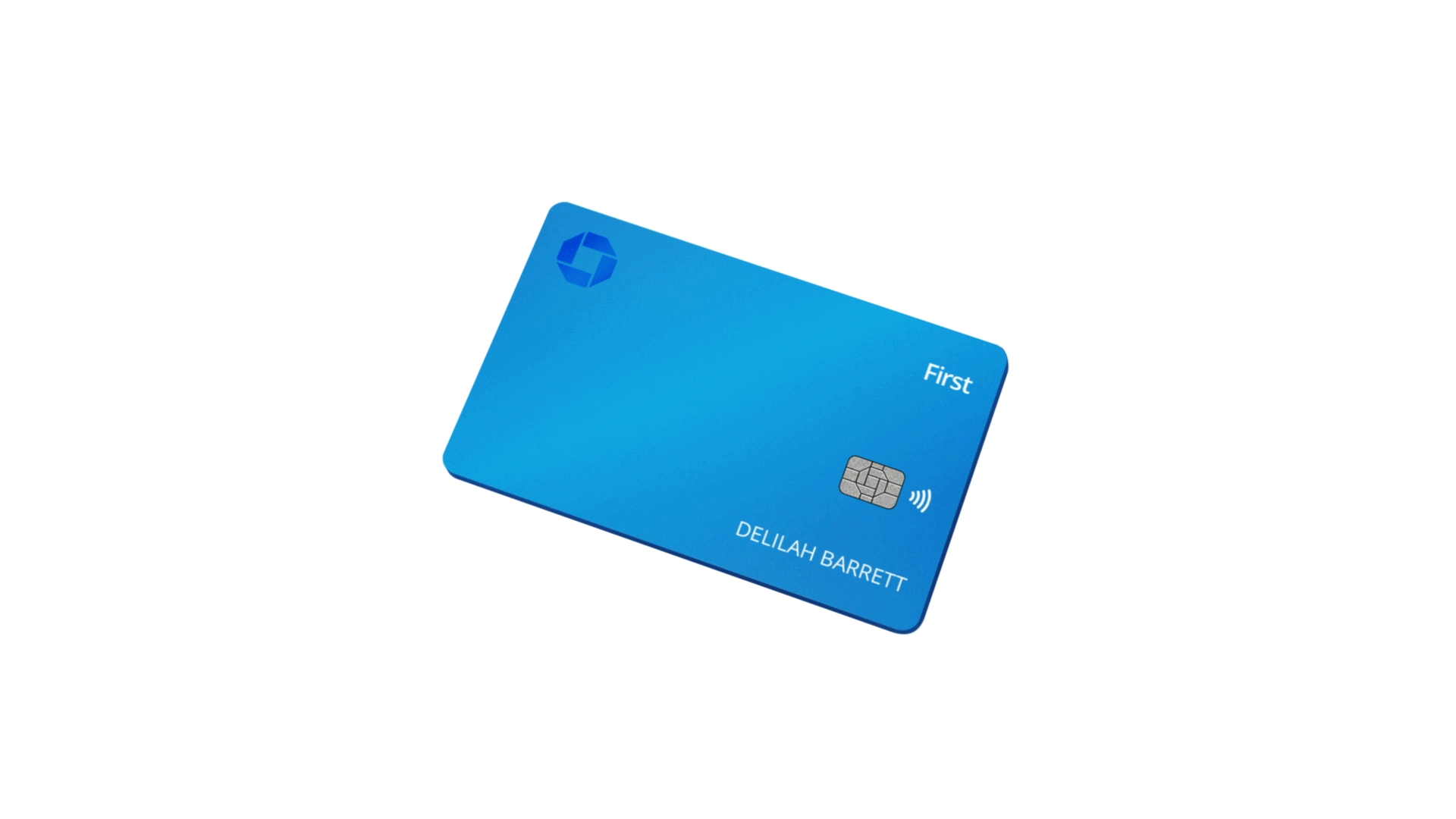
Equal parts playful and sophisticated the shine and reflectivity of the card was purposefully treated to tie the new color system of Chase First Banking together with the physical debit card.
Blue Gold


In addition to infusing youthfulness, the design system needed the flexibility to span many touchpoints and production constraints brought on by the pandemic. We found a way to make stock photography ownable and Gen Z-oriented. And we developed an illustration and animation style that could stretch from Chase First Banking to Chase Banks Masterbrand.
The Design System


Graphic novel book & digital experience
The Quest
A graphic novel for young teens that teaches good money habits for spending, saving and earning.

As part of the Chase First Banking education initiative to help young teens with financial independence, we partnered with illustration artist Rosemary Valero-O’Connel to create a fantastical graphic novel that promotes good money habits.
Our main characters are taken on a magical journey through different worlds such as The Desert of Dreams, Video Game Valley, Influencer Island and Grub Grove as they learn valuable lessons when it comes to spending, saving, and earning money.


My role & contribution
This was the start of a long working relationship with Chase Bank. My role and contribution to this particular project was foucused on three things.
To design a credit card that would resonate with Gen Z sensibilities.
To establish a visual identity for Chase First Banking to be applied not only within the campaign creative, but across all marketing and communication needs for this new sub-offering within the Chase Banking portfolio.
To help evolve the Chase Masterbrand with the inclusion of design principles and guidelines around Chase’s new more sophisticated approach to illustration.
Creative
Chris Gilbert - Copy
Lucy Downs - Art
Warren Teo - Design
Collin Hesterly - Illustration
Partizan - Animation
Rosemary Valero-O’Connel - Graphic Novel Illustration
Account
Jordan Middendorf
Brian Ivory
Production
Tim Xumsai
Ann-Maria Egisto
Leadership
Steve Street - ECD
Kristin Kriisa - CD, Copy
Cory Galster - GDD