CLIENT
360i
DELIVERABLES
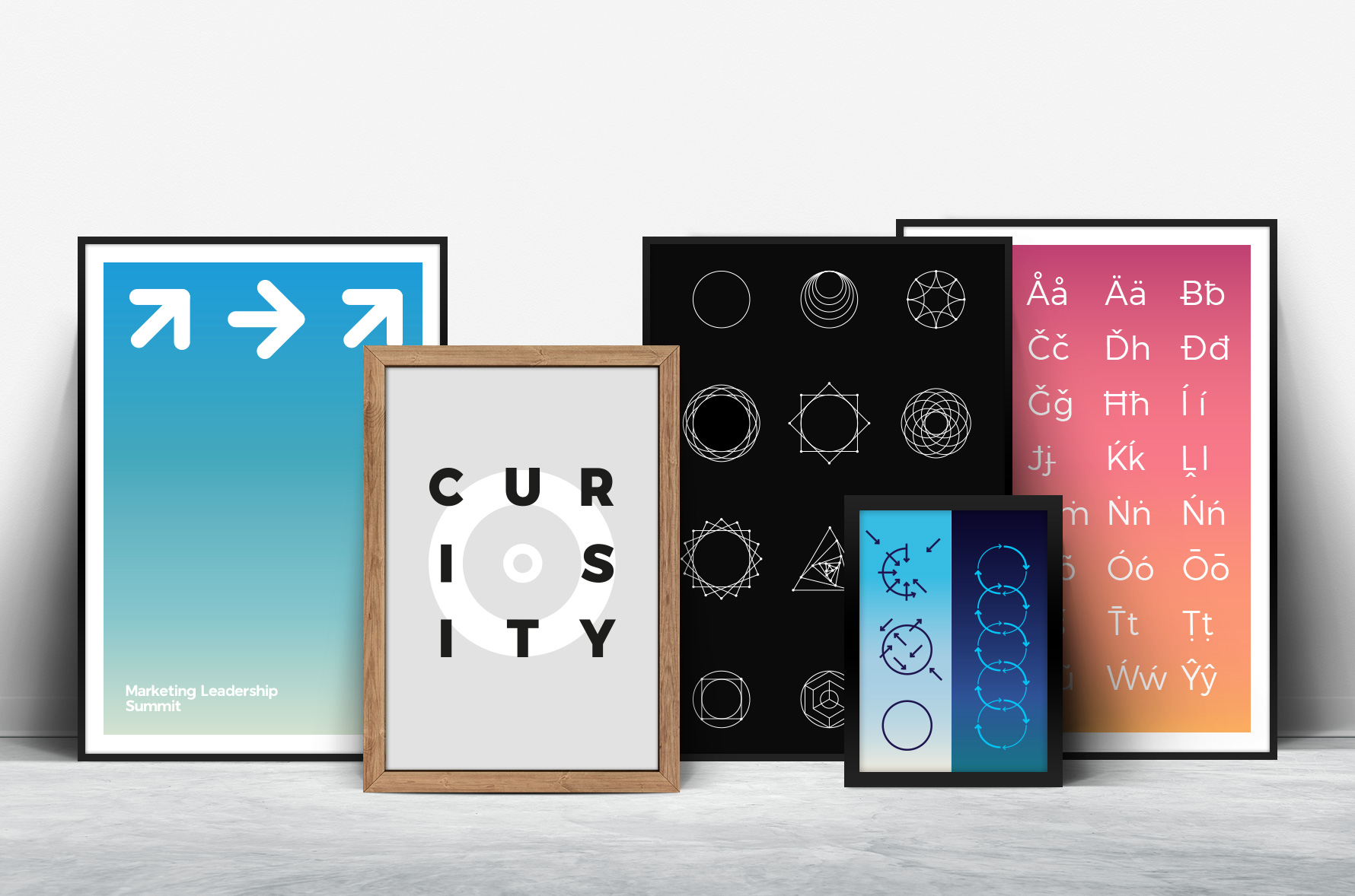
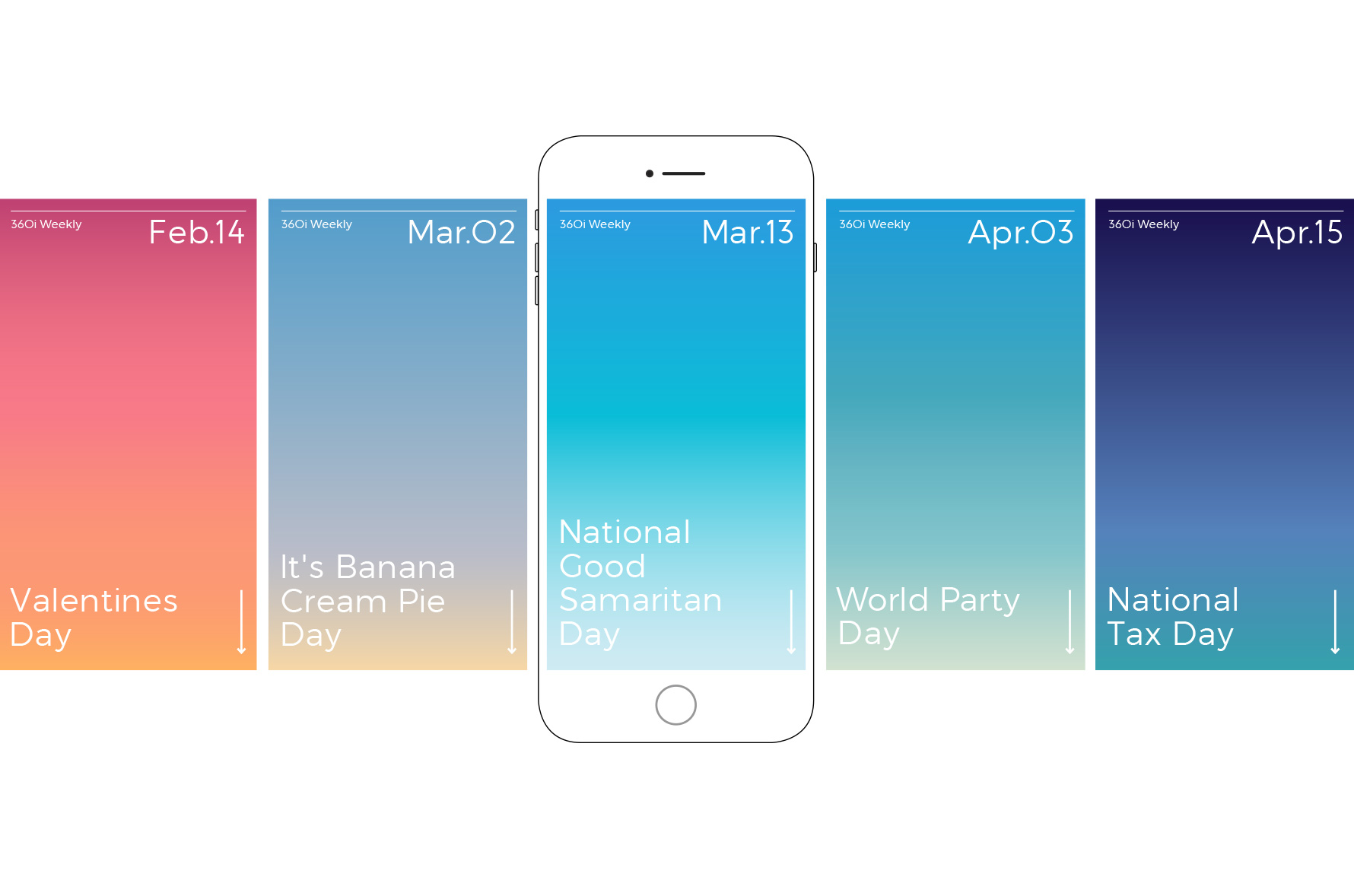
Brand System
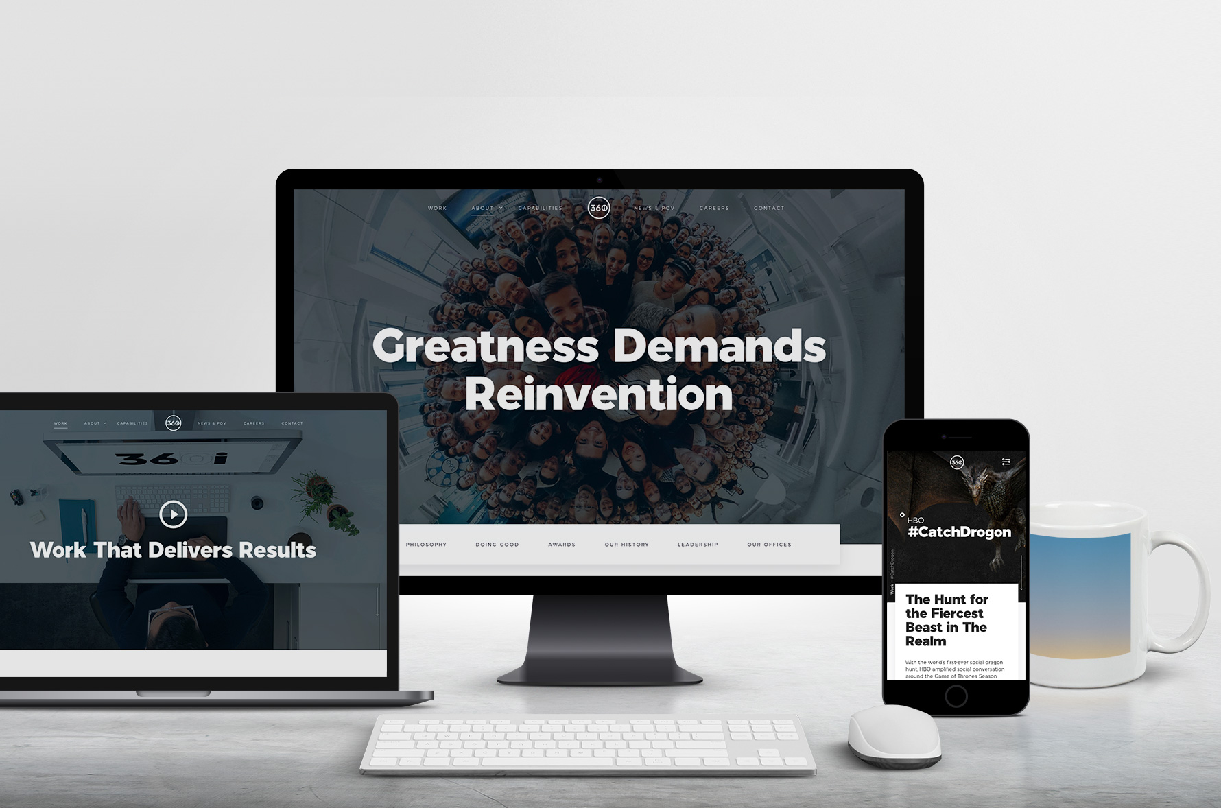
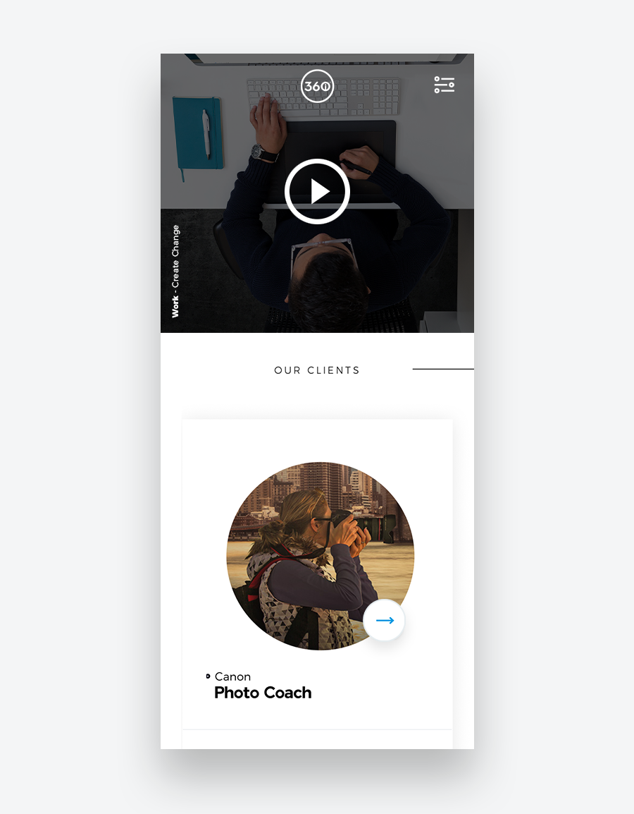
Website Redesign
Internal Templates
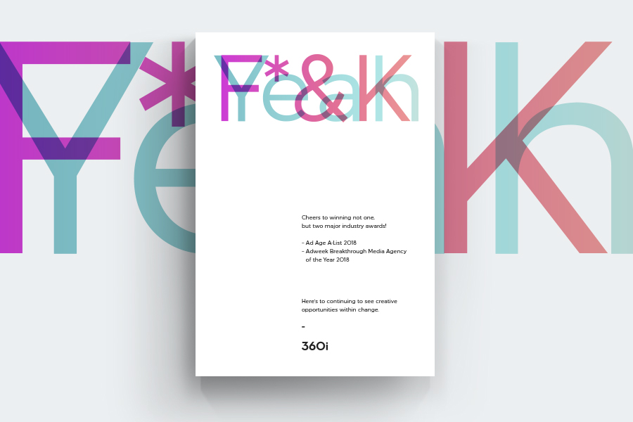
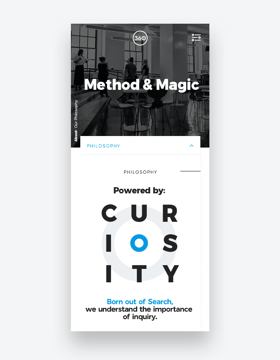
As a agency, 360i has never had difficulty describing its core values. Passion, Purpose, Perseverance. Powered by Curiosity. Fueled by Alchemy (difference capabilities working together).
However, when it came to visualizing those core values, the answer was often the same – "make it blue, include the 360i logo." This was never enough for a clearly defined and robust visual brand expression.
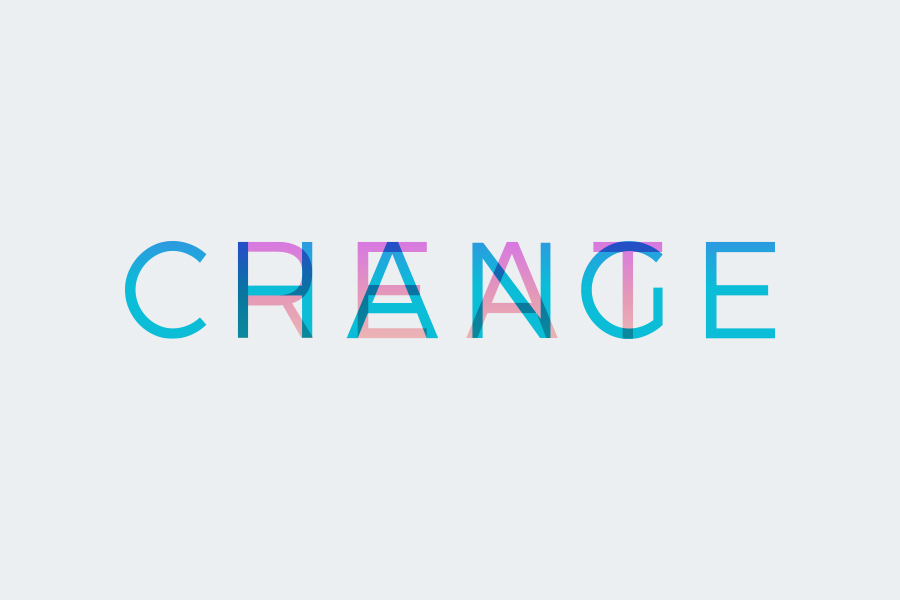
By breaking down the attributes of 360i's core values and taking inspiration from the idea of passion, purpose, perseverance, and curiosity – a new brand system was established. The core approach is an analogy to the constant movement of the earth sky. From sunrise, to sunset, to sunrise – 360i will always capitalize on change.
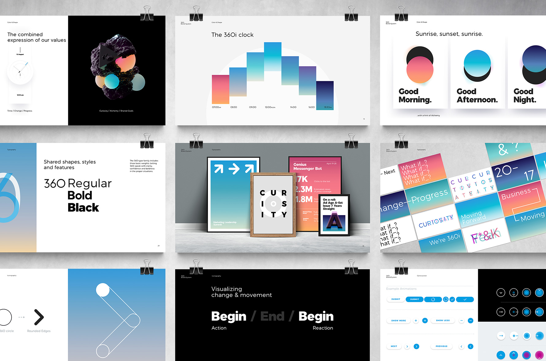

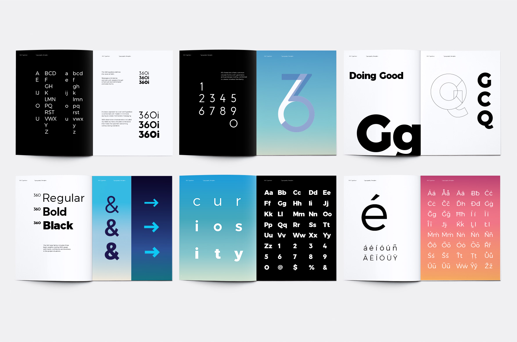
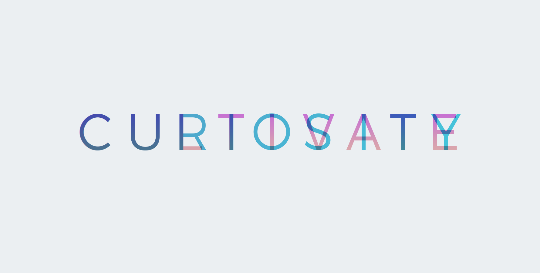
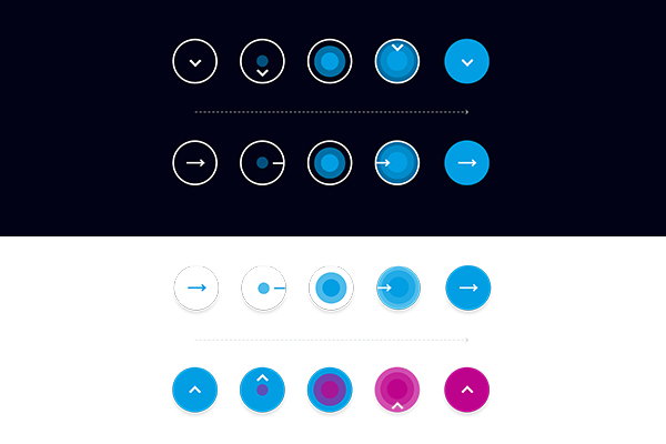
The 360 Typeface –
360 is a custom designed typeface that defines the voice of 360i. Messages
connect with readers through clear and simple shapes.
Grotesque approaches to a san serif typeface are combined with modern minimalist styling. 360’s distinctive characteristics included rounded counters, shoulders and bowls that make the letter-forms feel welcoming but not overly uniform.
360i – WEBSITE REDESIGN TEAM
Frank Lockwood – Director, User Experience
Cory Galster – Product Design Director
Lenton Alston – User Architect
Aldo De La Paz – Product Design Lead
Neal Gibeau – Content Strategy

TEAM
Sarah Hofstetter
– CEO
Abbey Klaassen
– CMO
Pierre Lipton
– CCO